| g e n u i n e i d e a s | ||||||
 |
 |
 |
 |
 |
 |
 |
| home | art and science |
writings | biography | food | inventions | search |
| know when to fold'em |
|
December 2010 Published in Morningstar Perspectives There are three steps in any investment cycle:
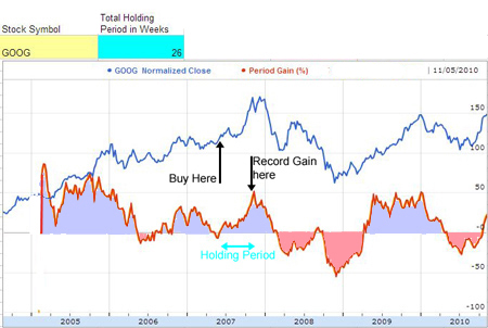
You shouldn't plan on buying if you don't also have a plan of when to sell. The Back-To-The-Future technique addresses the first step, by improving fund comparison transparency. It highlights those assets with a consistent record of sustained, superior returns. And consistent returns directly moderates the urgency of a buy/sell decision. Yet timing remains the biggest challenge for most investors. Everyone recalls a time when "had I just sold that morning", or "gotten in on the ground floor", they'd be rich. Trading more frequently feels like more opportunity. Many day traders, for example, buy and sell stocks every few minutes. They play a never-ending game of chicken, trying to outguess their fellow gamblers, while navigating through a fog of rumors and financial innuendo (although, as the market becomes more efficient and homogeneous, opportunities to generate a profit day-trading are thinning). In any case, most investors lack the skill, knowledge or stomach to trade on a twitch. And most investors are best served by choosing low cost, total market tracking funds and holding them for decades. Or dollar cost averaging. Yet it's still possible to make money investing tactically, by adopting a buy-and-hold strategy. Properly executed, a buy-and-hold strategy offers the dual advantages of solid returns and sector flexibility. But when to buy, and when to sell? It turns out stocks exhibit relatively consistent behavior over short and long time scales. Think of it like the weather, where the temperature on any single November day might exceed that in July, yet measured over a year, the summer is consistently warmer than winter. Similarly, over a period of days and even months, stocks appear to wander around aimlessly, but over quarters and years, grow or wither on fundamental news. Take Google as an example. The graph below plots Google's stock performance for the last six years (GOOG is the blue curve, which I've arbitrarily normalized and baseline shifted to fit on the same graph with the more important red curve. The stock price is included just as a guide to the eye). What does the red curve measure? Basically, the red curve tracks a series of buy-hold-sell transactions. For each date, it calculates the percentage return assuming you'd bought GOOG six months (26 weeks) earlier, and then sold. In other words, had you purchased Google on June 1st, 2007 and sold on Nov 30th, 2007 that period return would be plotted on Nov 30th of 2007 as a gain of ~50%. You can observe this particular 26 week holding period coincided with a stiff upward swing in Google stock (the blue curve), and thus the significant gain. I call this sequence of buy-hold-sell transactions a "Moving Holding Period"- MHP plot1.
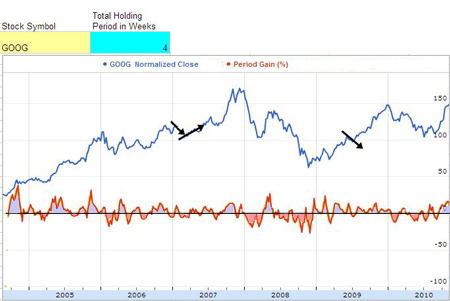
This graph demonstrates a simple point- had you bought GOOG at almost any time during the last six years, and held the stock for six months- you would have made a profit. Not always, but most of the time. On the other hand, if you hold a stock for only four weeks, it's more likely random events are driving the stock price, and your return will drop. The next plot, based on a moving four week holding period, demonstrates this effect quite clearly:
As you can plainly see, the red MHP return curve bounces around an average of zero, with a slight positive bias. The little black arrows indicate the reason- a one month holding period sometimes intercepts a minor upward bounce, but equally likely, catches a downward movement. On average, a single investment only yielded around a 2% absolute return. So you can eek out a small gain by trading this frequently, but just barely. More likely you'd lose money when short-term capital gains and trading costs are subtracted. And, with a short holding period the best trading days bob up and down almost weekly, turning trading into a game of "whack-a-mole". With a 26 month holding period, you can make a profit investing on any day, for stretches as long as a year. Leaving time to make a sound decision... Of course, the evening news and financial web sites all claim to explain the ultimate driving forces behind these minor excursions, and perhaps one could make a living taking their advice into account. But on average?... Thus it generally pays to buy and hold for a period longer than a month. What if you buy and hold for a year, instead of 4 weeks or even six months?
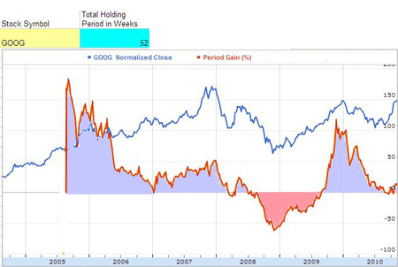
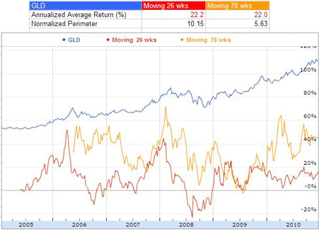
The gains (and losses) are now higher. With a longer holding period, a one-year bet on Google pays off handsomely, and you don't have to settle on a particular day, week or year to make a profit. But isn't there some way to avoid that nasty dip in late 2008? Certainly, even a naive investor would know enough to exit the market in the midst of a historic decline, cutting short their initial, planned holding period? Be warned! The key to a successful buy and hold strategy is discipline. You are overwhelmingly likely to misinterpret a temporary decline as a major rout, and sell at a loss just as the stock is about to zoom skyward. Look carefully at the blue curve, and notice how often a large decline presages a bigger gain, and vice-versa. If you think you are smart enough to outguess the market, well, good luck. For the rest of us mortals, accept the fact that the road to long term gains are paved with shallow potholes. Timing the market is problematical. Consider GLD- this precious metal has risen steadily for the last decade, and one might believe any holding period would do. So instead of the bank, GLD might offer a safe haven to park a bit of excess cash. But is it really that safe?
Note how the MHP plot immediately highlights the wide swings in GLD's return over the course of a year. In this particular example, both holding periods generated about the same annualized return2. But using GLD as a short-term savings account? Notice you can lose money betting on gold if held for only half a year! In fact, return volatility (the technical sounding "normalized perimeter3") is twice as large for the smaller holding period. In other words, the risk of missing the average is much higher for the shorter holding periods. Instead of timing the market down to an optimal day, the right holding period identifies stocks with track records where investing on any day during months or years resulted in positive gain. More precisely, the MHP technique identifies the natural periodicity of a stock. A holding period a few times longer than this natural period will deliver higher returns, more consistently, and with less risk. A holding period much longer may return only average results. The MHP technique also discovers trends the eye might overlook. In the case of VEURX, the Vanguard European Stock Index mutual fund, the MHP technique quickly identifies a less visible return periodicity, for 3 month buy/sell holding windows. A longer holding period is likely to yield higher returns, on average...
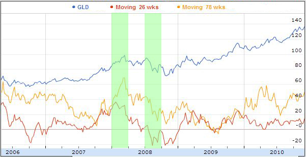
Many stock comparison engines produce a less informative version of this continually moving holding period technique. They plot a discretized "rolling return", on say every quarter, or on every year. But, as we demonstrated in the Back-To-The-Future article, such discretized returns swing wildly, depending on the intersection between fixed quarter boundaries and the natural rhythm of the stock. Overlaying one quarter wide green bands on the earlier GLD chart demonstrates the return within either quarter can vary by almost half, depending on exactly when you initiated a 26 week buy/sell period. But this important fact is lost in a table of quarterly prices.
The apparent simplicity of a quarterly returns bar graph hides a multitude of sins. Continuous curves are superior. The takeaway- There are two reasons to adopt a buy and hold strategy over a reliance on a broad market basket of securities. First, you may require liquidity and cannot commit to an open-ended investment period. Or, you hope to generate above average returns by investing in a "hot" market sector. The MHP technique cannot identify those outperforming sectors in advance, but can provide guidance (based on past performance) when choosing a holding period within that sector. The BTTF and MHP techniques transparently reveal past gain performance and risk. They highlight any natural rhythms to that sector's growth, and suggest a minimum holding period to maximize returns while minimizing risk. Longer holding periods generally produce greater returns with less risk, but there are exceptions. Always run the numbers first. Then, research the market segment and the macro economic conditions. And most importantly, stay true to your buy and hold strategy, even during the panic of bad times and the giddiness of prosperity. ---------------- 1 While far from standard, other analysts have devised similar techniques. For example, a few stock comparison sites (e.g. Morningstar) can be adjusted to generate an "MHP-like" plot with their rolling returns option, but not as easily or for all asset classes. You can even employ the same approach to analyze the entire history of the stock market. See Ed Easterling's plot in the NYTimes. While his actual numbers are open to debate (there are more than six valid ways to adjust for inflation, and no consistent method to adjust for taxes and fees), the general approach is very sound and revealing. 2 A technical aside regarding "average total return": The average total return is the arithmetic mean calculated by summing the percentage gain recorded on each trading week after holding a stock for the prescribed period, and dividing by the number of weeks. If you only invest once during the five years, the average return is more of an expected value. That is, on average you would receive that return, but if the return variation is high, the likelihood is small. Because you have money in the market only during the holding period, an annualized rather than a total return is most appropriate when comparing two holding periods. For example, in the GLD case, the 78 week average total return is 33%, versus 11% for a 26 week holding period. When annualized, both investments generated a 22% annual gain. Also note, while in these examples the annualized returns are independent of holding period, that is not always the case. Try inserting "S" and holding periods of 12 and 52 into the online tool for a counterexample. 3 High volatility is a signal to avoid buy-and-hold investing. Even though an average investment might generate a positive return, the chance of buying on the worst possible day is too high. But how do you compare volatility between funds? There are as many volatility metrics as there are analysts. Some offer mathematical convenience (e.g. a Gaussian metric), while other arise from connections to physics (e.g. a random walk metric). Each choice is appropriate in some circumstances, and misleading in others. I've designed a simple but robust metric- the "normalized perimeter". Basically, the perimeter is the length of the return curve, measured as if it were a shoreline and you keep track of the distance travelled on a walk along the craggy return curve. A smooth return curve is a short walk, while a return curve that bounces around wildly has a longer perimeter. I normalize the length by dividing the perimeter by the number of weeks in five years, and annualizing the return. Looking at the GLD plot above, it's clear by eye that the red curve is more volatile than the longer holding period yellow curve, and this is reflected in the normalized perimeter values of 10 and 5.6 |
Contact Greg Blonder by email here - Modified Genuine Ideas, LLC. |